
Colorado Mountain School
Website Usability Review
Client:
Colorado Mountain School exists to share the power of the mountains with adventurers who want to learn and explore by offering a number of courses ranging from novice to advanced levels of skill. They provide numerous teaching and climbing courses for groups or individuals. On top of that, they also have a variety of international trips available with some of the best and most qualified guides in the industry. If climbing isn’t your thing, Colorado Mountain School (CMS) has backcountry Skiing and Splitboarding options. This site encompasses all that it means to be an adventurer with a passion for the outdoors.
Team mission:
Colorado Mountain School gave my team and I an opportunity to explore their website in hopes of finding areas that they can improve on in regards to: improving their customer experience, increasing traffic, improving accessibility, and maximizing conversion rate.
Team plan:
My team and I sat down and figured out a step by step plan so that we could test the usability of this website based off the organizations goals. Below are the methods, tools, and results of this in depth review.
My Role:
UX Researcher, Testing Moderator
Team:
Grace Davig, Mar E Townsend, and James Sauer
Methods:
Evaluative Research/Usability Review
Remote User Testing'/Think Aloud Strategy
Data Synthesis/Affinity Diagramming
Tools:
Pen and Paper
Power Point
Figma
Zoom
Shared Google Docs
Sketch
Keynote
Deliverable:
Colorado Mountain School Values:
-
![]()
We Believe in Challenge & Adventure
The mountains are forces for change. Adventure, challenge, fun, and humble awe remind us how alive and connected we are to the natural world.
-
![]()
We Believe in Community
The mountains unite us. Our passion for exploring and learning is the foundation for trust, teamwork, and lifelong friendships.


Giving Colorado Mountain School an in-depth and thorough review
Understanding CMS as an entity was the foundation we wanted to build on. Before beginning analysis of the website, my team and I went through the notes that were given to us by CMS. In these notes were some of the site goals along with goals that CMS hoped to achieve through the testing process. From there, we came up with our own set of goals for the review based off our understanding of Colorado Mountain School’s values, organization goals, and site goals.
CMS organization goals:
Share the power of the mountains with adventurers who want to learn and explore.
Create extraordinary adventures and experiences unmatched in the industry.
Educate and mentor those passionate about discovery (external and internal).
Improve quality of life for employees to attract the country’s best guides and staff.
CMS site goals:
Attract affluent adventurers and groups nationwide, highlighting CMS’s unique location and access to the outdoors.
Lean into our reputation as a mountain educator.
Be accessible to a wide range of visitors and potential clients
Team goals:
Pinpoint general navigation and accessibility issues throughout the CMS website.
Gather feedback regarding both the positive and negative aspects of the site flow.
Find out which parts of the site confuse or overwhelm the user and determine what changes need to be made in order to make their experience as seamless as possible.
Determine how engaged users are at the point of sale.
Usability Review/Heuristic Analysis

Screenshot of the heuristics scale I came up with followed by the heuristics chart used. You can view the full review below.
Once the review goals were established, an individual usability review and heuristic analysis was conducted so that I could better understand what issues might arise throughout user testing. Doing this helped prep for the remote usability tests.
Takeaways from heuristic analysis:
Many Heuristics were demonstrated!
Several Heuristics were violated:
#4, Accommodation, Technical Clarity (Merchandise section)
#2, Human Limitations (Information overload dropdown menu)
#11, Technical Clarity (List options for merchandise on page)
#10, Accuracy (Price is listed twice)
Script Writing, Creative Thinking Collaboration
After conducting our own usability reviews, the team came together to compile our findings. Based off these findings, we were able to write up both a moderator script for the person conducting the usability test, and an observer/note-taking guide for those observing the test. This was done by creative thinking collaboration.
To the right are pictures of our shared notes which were used to create scripts for remote usability testing. We each contributed our key findings and highlighted the main pain points that were present which we thought would be encountered in the next step of the review. You can view the moderator script by clicking the link above or the button below.
Among these pain points were:
General navigation issues
Numerous accessibility issues within the profiles/checkout sections
Lack of prompts/calls to action using only icons

Screenshot of shared notes
Usability Test Execution, Think Aloud Strategy

Each team member was given the task of outsourcing 1-2 of our own users. The users were asked to perform a variety of tasks using think aloud strategy.
Using the collaborative script, we went through the CMS website over a 30 minute period per user. These tests were done remotely using zoom.
We also had 4 users that participated with the entire team present. One team member was moderating while the other three took detailed notes.
Synthesizing The Data, Affinity Diagram
Once the usability tests were complete, my team came together yet again to go over all of the input we had received from the users. We created an affinity diagram within a collaborative whiteboard (Figma). From this data, we came up with several categories that had various titles so that we could synthesize our research in a structured format.
The Categories:
General site confusion
Banner and page scrolling issues
Positive Feedback
Negative Feedback
Merchandise/Checkout

Screenshot of affinity diagram
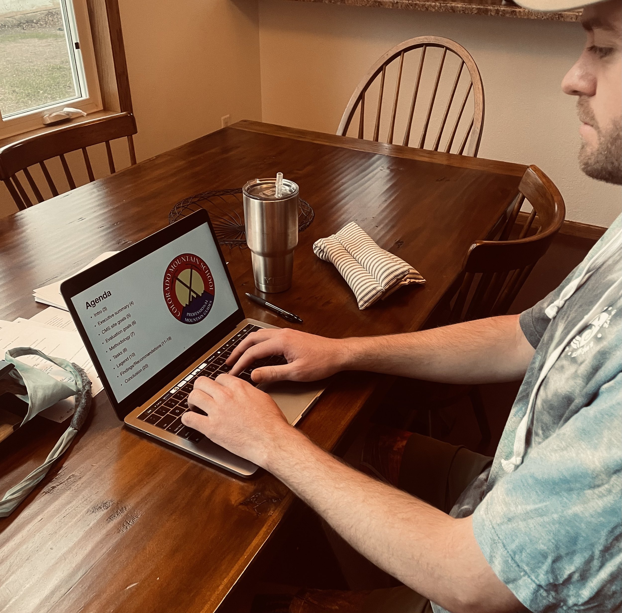
Final Solution, Findings and Recommendations Report

Screenshots from the report
Once all of the data was synthesized, the team split up and we each went into our own space to create the final product. The findings and recommendation report was the final step of the CMS website review.
This report consists of the data which myself, my team, and the test participants found. Before making the report, I looked back at the original goals my team came up with and then proceeded to piece the information together into something that will hopefully help CMS meet their respective goals as an organization. Focussing on the areas that needed improvement was the priority.
Key Points:
Make the guide page more accessible/scannable
Clean up areas of the checkout and merchandise sections
Add call to action buttons in the appropriate places
In conclusion:
Colorado Mountain School has a lot of variety to offer their users. Their website is thorough and is undoubtedly a place where adventurers from all walks of life come together to experience the outdoors, regardless of skill level. There were several pain points found in this usability review:
Accesibility issues on the home page
Merchandise section had some errors that are easily fixed
Filtering of guides could be made more succinct to help the users